

Preface
This post carries a strong personal tone. If you find it uncomfortable to read, please close it as soon as possible. This article is only for my personal learning notes. You’re welcome to repost or share it within the scope of the license, but please respect the copyright and keep the original link. Thank you for your understanding and cooperation. If you find this site helpful, you can subscribe via RSS. Thanks for your support!
The following content is my learning notes.
DevEco Studio Shortcuts
| Shortcut | Purpose | Notes |
|---|---|---|
⌘(Command) + B | Jump to the definition file of a class or object | Similar to ⌘(Command) + → in Xcode |
| ⌘(Command) + ⇧(Shift) + ⌫(Back) | The opposite of the above, go back one level | Similar to ⌘(Command) + ← in Xcode |
After watching the HarmonyOS tutorial videos and reading the documentation a few times, I decided to record all the basics that are easy to forget, so I can look them up anytime when I need them later.
ArkTS Basics
Lifecycle Composed of Pages and Custom Components
First, let’s understand that a component is the basic unit that makes up the UI. We need to clarify the relationship between custom components and pages.
- Custom component: a UI unit decorated with
@Component. It can combine multiple system components to achieve UI reuse, and it can call the component’s lifecycle. - Page: the UI page of an app. It can be composed of one or more custom components. A custom component decorated with @Entry is the entry component of the page, i.e., the root node of the page. A page can have one and only one @Entry. Only components decorated with @Entry can call the page lifecycle.
1
2
3
4
5
6
7
@Entry
@Component
struct LiftCycle {
  build() {
   	...
   }
}
- struct: custom components are implemented based on struct. The combination of struct + custom component name + {…} forms a custom component, and inheritance is not allowed. For the instantiation of a struct, the
newkeyword can be omitted (custom component names, class names, and function names cannot be the same as system component names.) - @Component: the @Component decorator can only decorate data structures declared with the struct keyword. A struct decorated with @Component gains componentization capabilities, and needs to implement the build method to describe the UI. A struct can only be decorated by one @Component. (Starting from API version 9, this decorator supports use in ArkTS cards.)
- build() function: the build() function is used to define the declarative UI description of a custom component. A custom component must define the build() function.
- @Entry: a custom component decorated with @Entry will serve as the entry of the UI page. In a single UI page, at most one custom component can be decorated with @Entry. @Entry can accept an optional LocalStorage parameter.
Starting from API version 9, this decorator supports use in ArkTS cards.
Starting from API version 10, @Entry can accept an optional LocalStorage parameter or an optional EntryOptions parameter.
EntryOptions10+
Named route jump options
| Name | Type | Required | Description |
|---|---|---|---|
| routeName | string | No | Indicates the name of the page as a named route. |
| storage | LocalStorage | No | Page-level UI state storage. |
1
2
3
4
5
@Entry({ routeName : 'myPage' })
@Component
struct MyComponent {

}
- @Reusable: a custom component decorated with @Reusable has reusability capability.
1
2
3
4
@Reusable
@Component
struct MyComponent {
}
Starting from API version 10, this decorator supports use in ArkTS cards.
The Lifecycle of Pages and Components
The lifecycle of a component decorated with @Entry provides the following lifecycle interfaces:
onPageShow: triggered once every time the page is shown, including scenarios such as routing and the app entering the foreground. Only takes effect for custom components decorated with @Entry.onPageHide: triggered once every time the page is hidden, including scenarios such as routing and the app entering the background. Only takes effect for custom components decorated with @Entry.onBackPress: triggered when the user taps the back button. Only takes effect for custom components decorated with @Entry.
// The lifecycle of a component decorated with @Entry, demonstrated by the code below
1
2
3
4
5
6
7
8
9
10
11
12
13
//Triggered every time the page is shown
onPageShow(): void {
	console.log("LiftCycle onPageShow")
}

//Triggered every time the page is hidden
onPageHide(): void {
	console.log("LiftCycle onPageHide")
}
//Triggered when the back button is tapped
onBackPress(): boolean | void {
	console.log("LiftCycle onBackPress")
}
The component lifecycle, i.e., the lifecycle of a custom component usually decorated with @Component, provides the following lifecycle interfaces:
aboutToAppear: this interface is called back when the component is about to appear. Specifically, it runs after a new instance of the custom component is created and before its build() function is executed.aboutToDisappear: the aboutToDisappear function runs before the custom component is destroyed. Changing state variables in the aboutToDisappear function is not allowed; in particular, modifying @Link variables may cause unstable application behavior.
1
2
3
4
5
6
7
8
//The lifecycle of a custom component decorated with @Component
aboutToAppear(): void {
	console.log("LiftCycle aboutToAppear")
}

aboutToDisappear(): void {
	console.log("LiftCycle aboutToDisappear")
}
The lifecycle flow is shown in the figure below, which illustrates the lifecycle of a component decorated with @Entry (the home page).
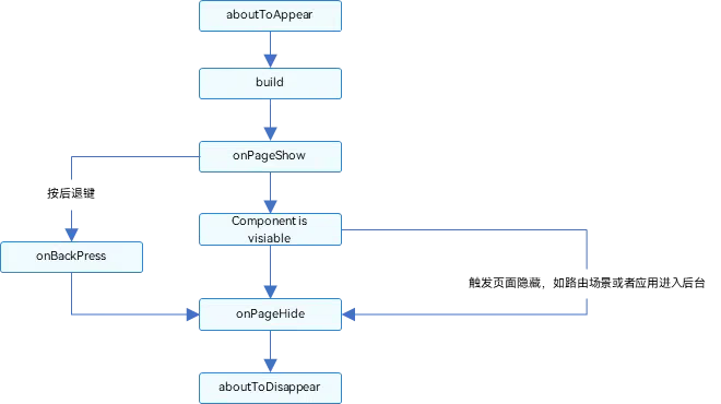
**From this we can see that the lifecycle methods of a @Component include all the page lifecycle method calls of @Entry in between.
The sample code demonstrates a LifeCycle that adds a Child subcomponent, and pushes to a new page LifeCycleDetail by tapping a button.
1
2
3
4
5
6
7
8
9
10
11
12
13
14
15
16
17
18
19
20
21
22
23
24
25
26
27
28
29
30
31
32
33
34
35
36
37
38
39
40
41
42
43
44
45
46
47
48
49
50
51
52
53
54
55
56
57
58
59
60
61
62
63
64
65
66
67
68
69
70
71
72
73
74
75
76
77
// LiftCycle.ets
import router from '@ohos.router';

@Entry
@Component
struct LiftCycle {
  @State showChild: boolean = true;
  @State btnColor:string = "#FF007DFF"

  // Component lifecycle
  aboutToAppear() {
    console.info('LiftCycle aboutToAppear');
  }

  // Only components decorated with @Entry can call the page lifecycle
  onPageShow() {
    console.info('LiftCycle onPageShow');
  }
  // Only components decorated with @Entry can call the page lifecycle
  onPageHide() {
    console.info('LiftCycle onPageHide');
  }

  // Only components decorated with @Entry can call the page lifecycle
  onBackPress() {
    console.info('LiftCycle onBackPress');
    this.btnColor ="#FFEE0606"
    return true // 返回true表示页面自己处理返回逻辑,不进行页面路由;返回false表示使用默认的路由返回逻辑,不设置返回值按照false处理
  }

  // Component lifecycle
  aboutToDisappear() {
    console.info('LiftCycle aboutToDisappear');
  }

  build() {
    Column() {
      // this.showChild为true,创建Child子组件,执行Child aboutToAppear
      if (this.showChild) {
        Child()
      }
      // this.showChild为false,删除Child子组件,执行Child aboutToDisappear
      Button('delete Child')
        .margin(20)
        .backgroundColor(this.btnColor)
        .onClick(() => {
          this.showChild = false;
        })
      // push到page页面,执行onPageHide
      Button('push to next page')
        .onClick(() => {
          router.pushUrl({ url: 'pages/LifeCycleDetail' });
        })
    }

  }
}

@Component
struct Child {
  @State title: string = 'SUNYAZHOU.COM';
  // Component lifecycle
  aboutToAppear() {
    console.info('Child aboutToAppear')
  }

  // Component lifecycle
  aboutToDisappear() {
    console.info('Child aboutToDisappear')
  }

  build() {
    Text(this.title).fontSize(50).margin(20).onClick(() => {
      this.title = 'SUNYAZHOU.COM ArkUI';
    })
  }
}
Here’s the LifeCycleDetail code.
1
2
3
4
5
6
7
8
9
10
11
12
13
14
15
16
17
18
19
20
21
22
23
24
25
26
27
28
29
30
31
32
33
34
35
36
37
38
39
@Entry
@Component
struct LifeCycleDetail {
  @State textColor: Color = Color.Black;
  @State num: number = 0

  onPageShow() {
    this.num = 5
    console.log("LifeCycleDetail onPageShow");
  }

  onPageHide() {
    console.log("LifeCycleDetail onPageHide");
  }

  onBackPress() { // 不设置返回值按照false处理
    this.textColor = Color.Grey
    this.num = 0
    console.log("LifeCycleDetail onBackPress");
  }

  aboutToAppear() {
    this.textColor = Color.Blue
  }

  build() {
    Column() {
      Text(`num 的值为:${this.num}`)
        .fontSize(30)
        .fontWeight(FontWeight.Bold)
        .fontColor(this.textColor)
        .margin(20)
        .onClick(() => {
          this.num += 5
        })
    }
    .width('100%')
  }
}
When we start the preview, the lifecycle functions run in this order:
1
2
3
app Log: LiftCycle aboutToAppear
app Log: Child aboutToAppear
app Log: LiftCycle onPageShow
When we tap Push:
1
2
app Log: LiftCycle onPageHide
app Log: LifeCycleDetail onPageShow
When tapping back:
1
2
3
LifeCycleDetail onBackPress
LifeCycleDetail onPageHide
LiftCycle onPageShow
When deleting Child:
1
app Log: Child aboutToDisappear
Official documentation on the page and custom component lifecycle
Basic Types and Functions
1
2
3
4
5
6
7
8
9
10
11
12
13
14
15
16
17
18
19
20
21
22
23
24
25
26
27
28
29
30
31
32
33
34
35
36
let number1: number = 99 // 默认情况下 正常情况下给的数字 就是十进制的哦
let number2: number = 0b10011 // 2进制 由0b开头的
let number3: number = 0o1234567 // 8进制 由0o开头的
let number4: number = 0x6464ab // 16进制 由日x开头的

// TODO String
let string1: string = 'sunyazhou'
let string2: string = "sunyazhou"
let string3:string = "你的名字是: ${string2}"

// TODO Union type, boolean: true/false
let objectType : string | number | boolean
objectType = true
objectType = "sunyazhou"
objectType = 635464
objectType = false

// TODO Array
let stringArray1: Array<string> = ['AAA','BBB','CCC']; //0下标开始的
let stringArray2: string[] = ['AAA','BBB','CCC'];

// TODO Enum
enum Color {Red, Green, Yellow};
let color: Color = Color.Red;

// TODO Tuple, same as tuples in Swift; think of it as a multi-type dictionary where keys are strings and values are different data types
let name1:[string, number];
name1 = [@"孙先生", 20]; //必须按照规定顺序和类型写内容

// TODO void: no return type
function name(params): void {}

// Null
let str1: null = null
// undefined
let str2: undefined = undefined
Scope
1
2
3
4
5
6
7
8
9
10
11
12
13
14
15
16
17
18
19
20
@Entry
@Component
struct LearnDetail {
  @State message: string = 'Hello World';

  // Inside, no let is needed; outside, members need let
  number1: number = 99

  build() {
    Row() {
      Column() {
        Text(this.message)
          .fontSize(50)
          .fontWeight(FontWeight.Bold)
      }
      .width('100%')
    }
    .height('100%')
  }
}
The ArkUI Section
Image Control
Loading regular local resources.
1
Image($r(app.media.icon))
Loading network resources.
1
Image("https://www.sunyazhou.com/assets/images/20240116HarmonyPhoneSendFileTomacOS/harmonyOS.avif")
Loading any local resource.
1
Image($rawfile("sunyazhou.png"))
The @Styles Decorator
The @Styles decorator can extract multiple style settings into a single method that can be called directly where the component is declared. Through the @Styles decorator, you can quickly define and reuse custom styles. It’s used to quickly define and reuse custom styles.
- Currently @Styles only supports common attributes and common events.
- @Styles methods don’t support parameters.
Starting from API version 9, this decorator supports use in ArkTS cards.
Using a style wrapped in a global @Styles.
1
2
3
4
5
@Styles function globalStyles() {
  .width(150)
  .height(300)
  .backgroundColor(Color.Pink)
}
Defining a style wrapped in @Styles inside a component.
1
2
3
4
5
6
7
8
9
10
11
12
13
14
15
16
struct LearnDetail {
  @State heightValue: number = 100
  // @Styles defined inside a component
  @Styles innerStyle() {
    .width(200)
    .height(this.heightValue)
    .backgroundColor(Color.Yellow)
    .onClick(() => {
      this.heightValue = 200
    })
  }

  build() {
    ...
  }
}
How to use it.
1
2
3
4
5
6
7
8
9
10
11
12
13
14
15
16
17
18
19
20
21
22
23
24
25
26
27
28
29
30
31
32
33
34
35
36
37
@Entry
@Component
struct LearnDetail {
  @State heightValue: number = 100
  // @Styles defined inside a component
  @Styles innerStyle() {
    .width(200)
    .height(this.heightValue)
    .backgroundColor(Color.Yellow)
    .onClick(() => {
      this.heightValue = 200
    })
  }

  build() {
    Row() {
      Column() {
        // Use the global @Styles style
        Text('sunyazhou.com')
          .globalStyles ()
          .fontSize(30)
        // Use the @Styles style defined inside the component
        Text('迈腾大队长')
          .innerStyle()
          .fontSize(30)
      }
      .width('100%')
    }
    .height('100%')
  }
}

@Styles function globalStyles() {
  .width(150)
  .height(300)
  .backgroundColor(Color.Pink)
}
That’s how you use the @Styles decorator. Refer to the official @Styles documentation
The @Extend Decorator: Defining Extended Component Styles
Decorator usage syntax:
1
@Extend(UIComponentName) function functionName { ... }
Unlike @Styles, @Extend only supports definition at the global level and doesn’t support definition inside components.
- Unlike @Styles, @Extend supports wrapping the private properties and private events of a specified component, as well as calling pre-defined @Extend methods of the same component.
- Unlike @Styles, methods decorated with @Extend support parameters. Developers can pass parameters when calling, and the call follows the TS pass-by-value calling convention.
- The parameter of a method decorated with @Extend can be a function, serving as the handler for an Event.
- The parameter of @Extend can be a state variable. When the state variable changes, the UI can be refreshed and rendered normally.
- @Extend supports covariant calls.
Here’s a covariant call:
1
2
3
4
5
6
7
8
9
// @Extend(Text)可以支持Text的私有属性fontColor
@Extend(Text) function fancy () {
  .fontColor(Color.Red)
}
// superFancyText可以调用预定义的fancy
@Extend(Text) function superFancyText(size:number) {
    .fontSize(size)
    .fancy() //这里调用的是上方定义的@extend
}
Here’s some sample code using @Extend:
1
2
3
4
5
6
7
8
9
10
11
12
13
14
15
16
17
18
19
20
21
22
23
24
25
26
27
28
29
30
31
32
@Entry
@Component
struct LearnDetail {
  @State heightValue: number = 100

  build() {
    Row() {
      Column() {
        Text("sunyazhou.com").textExtend1(20, Color.Green)
        Text("迈腾大队长")
          .textExtend1(20, Color.Blue)
      }
      .width('100%')
    }
    .height('100%')
  }
}

@Extend(Text) function textStyles1() {
  .textAlign(TextAlign.Center)
  .fontStyle(FontStyle.Italic)
  .decoration({
    type: TextDecorationType.Underline
  })
}

@Extend(Text) function textExtend1(fontSize: number, fontColor: Color) {
  .fontSize(fontSize)
  .fontColor(fontColor)
  .textStyles1()
}
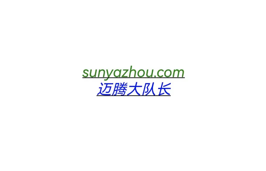
Refer to the official @Extend documentation
The @Prop Decorator: One-Way Parent-Child Synchronization
Initialization rules diagram
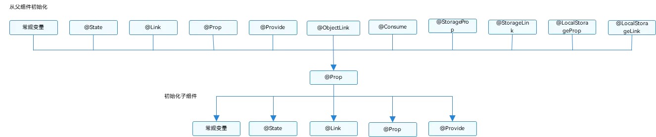
Below is sample code for one-way passing.
- Prop can’t be assigned.
1
2
3
4
5
6
7
8
9
10
11
12
13
14
15
16
17
18
19
20
21
22
23
24
25
26
27
28
29
30
31
32
33
34
35
36
37
38
39
40
41
42
43
44
45
46
47
48
49
50
51
52
53
54
55
56
57
58
59
60
61
@Entry
@Component
struct LearnDetail {
  @State msg: string = "sunyazhou.com"
  build() {
    Row() {
      Column() {
        Text(this.msg).textExtend1(30, Color.Green)
        Button("点击修改传透到子组件",{type: ButtonType.Normal})
          .borderRadius(8)
          .backgroundColor(0x317aff)
          .width(180)
          .height(40)
          .onClick(()=>{
              console.log('点击修改传透到子组件')
              this.msg = this.msg === "sunyazhou.com" ? "迈腾大队长" : "sunyazhou.com"
          })
        LearnDetailProp1({name :this.msg})
      }
      .width('100%')
    }
    .height('100%')
  }
}

// @prop装饰状态数据,方便父与子组件之问进行数据传递与同步 父State--------->prop 单向
@Component
struct LearnDetailProp1 {
  @Prop name: string //Prop不能赋值
  build() {
    Column() {
      Text("www." + this.name).textStyles1()
      Button("单向传递").buttonStyle1(ButtonType.Normal)
        .onClick(()=>{
          this.name = "Prop修饰器修改内容"
        })
    }
  }
}

@Extend(Button) function buttonStyle1 (type :ButtonType) {
  .type(type)
  .borderRadius(8)
  .backgroundColor(0x317aff)
  .width(90)
  .height(40)
}

@Extend(Text) function textStyles1() {
  .textAlign(TextAlign.Center)
  .fontStyle(FontStyle.Italic)
  .decoration({
    type: TextDecorationType.Underline
  })
}

@Extend(Text) function textExtend1(fontSize: number, fontColor: Color) {
  .fontSize(fontSize)
  .fontColor(fontColor)
  .textStyles1()
}

The @Link Decorator: Two-Way Parent-Child Synchronization
Here’s the sample code:
1
2
3
4
5
6
7
8
9
10
11
12
13
14
// @Link装饰状态数据,方便父与子组件之问进行数据传递与同步 父State <--------->prop 双向传递
@Component
struct  LearnDetailLink1 {
  @Link lineName: string //@Link不能赋值
  build() {
    Column() {
      Text("Link数据:" + this.lineName).textStyles1()
      Button("双向传递").buttonStyle1(ButtonType.Normal)
        .onClick(()=> {
            this.lineName = "被修改的 Link数据"
        })
    }
  }
}
Effect demonstration
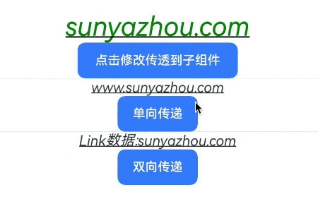
A complete demonstration based on the @Prop code above.
1
2
3
4
5
6
7
8
9
10
11
12
13
14
15
16
17
18
19
20
21
22
23
24
25
26
27
28
29
30
31
32
33
34
35
36
37
38
39
40
41
42
43
44
45
46
47
48
49
50
51
52
53
54
55
56
57
58
59
60
61
62
63
64
65
66
67
68
69
70
71
72
73
74
75
76
77
@Entry
@Component
struct LearnDetail {
  @State msg: string = "sunyazhou.com"
  build() {
    Row() {
      Column() {
        Text(this.msg).textExtend1(30, Color.Green)
        Button("点击修改传透到子组件",{type: ButtonType.Normal})
          .borderRadius(8)
          .backgroundColor(0x317aff)
          .width(180)
          .height(40)
          .onClick(()=>{
              console.log('点击修改传透到子组件')
              this.msg = this.msg === "sunyazhou.com" ? "迈腾大队长" : "sunyazhou.com"
          })
        Divider()
        LearnDetailProp1({name :this.msg})
        Divider()
        LearnDetailLink1({lineName :this.msg})
      }
      .width('100%')
    }
    .height('100%')
  }
}

@Component
struct LearnDetailProp1 {
  @Prop name: string //Prop不能赋值
  build() {
    Column() {
      Text("www." + this.name).textStyles1()
      Button("单向传递").buttonStyle1(ButtonType.Normal)
        .onClick(()=>{
          this.name = "Prop修饰器修改内容"
        })
    }
  }
}
// @Link装饰状态数据,方便父与子组件之问进行数据传递与同步 父State <--------->prop 双向传递
@Component
struct  LearnDetailLink1 {
  @Link lineName: string //@Link不能赋值
  build() {
    Column() {
      Text("Link数据:" + this.lineName).textStyles1()
      Button("双向传递").buttonStyle1(ButtonType.Normal)
        .onClick(()=> {
            this.lineName = "被修改的 Link数据"
        })
    }
  }
}

@Extend(Button) function buttonStyle1 (type :ButtonType) {
  .type(type)
  .borderRadius(8)
  .backgroundColor(0x317aff)
  .width(90)
  .height(40)
}

@Extend(Text) function textStyles1() {
  .textAlign(TextAlign.Center)
  .fontStyle(FontStyle.Italic)
  .decoration({
    type: TextDecorationType.Underline
  })
}

@Extend(Text) function textExtend1(fontSize: number, fontColor: Color) {
  .fontSize(fontSize)
  .fontColor(fontColor)
  .textStyles1()
}
The @Provide and @Consume Decorators: Two-Way Synchronization with Descendant Components
@Provide and @Consume are applied to two-way data synchronization with descendant components, used in scenarios where state data is passed across multiple levels. Unlike the named-parameter passing between parent and child components mentioned above, @Provide and @Consume free you from the constraints of the parameter-passing mechanism and enable cross-level passing.
The variable decorated with @Provide is in the ancestor component, and can be understood as a state variable “provided” to descendants. The variable decorated with @Consume is in the descendant component, and “consumes (binds)” the variable provided by the ancestor component.
The state variables decorated with @Provide/@Consume have the following characteristics:
The state variable decorated with @Provide is automatically available to all its descendant components, i.e., the variable is “provided” to its descendant components. From this we can see the convenience of @Provide: developers don’t need to pass variables between components repeatedly.
Descendants use @Consume to obtain the variables provided by @Provide, establishing two-way data synchronization between @Provide and @Consume. Unlike @State/@Link, the former can be passed between parent and child components across multiple levels.
@Provide and @Consume can be bound through the same variable name or the same variable alias. It’s recommended that they share the same type; otherwise implicit type conversion may occur, leading to abnormal application behavior.
1
2
3
4
5
6
7
// 通过相同的变量名绑定
@Provide a: number = 0;
@Consume a: number;

// 通过相同的变量别名绑定
@Provide('a') b: number = 0;
@Consume('a') c: number;
As you can see, these decorators use a unified identifier and consistent types. Here are the details from the documentation:
| @Provide variable decorator | Description |
|---|---|
| Decorator parameter | Alias: a constant string, optional. If an alias is specified, variables are bound through the alias; if not, variables are bound through the variable name. |
| Synchronization type | Two-way synchronization. Data is synchronized from the @Provide variable to all @Consume variables and in the reverse direction. The two-way synchronization behavior is the same as the combination of @State and @Link. |
… For more content, please refer to the official documentation
1
2
3
4
5
6
7
8
9
10
11
12
13
14
15
16
17
18
19
20
21
22
23
24
25
26
27
28
29
30
31
32
33
34
35
36
37
38
39
40
41
42
43
44
45
46
47
48
49
50
51
52
@Entry
@Component
struct ProvideConsumeDemo {
  @Provide("com.sunyazhou.message.provide_consume") message: string = "sunyazhou.com"
  build() {
    Row() {
      Column() {
        Text(this.message).textExtend2(30, Color.Black)
          .onClick( ()=> {
            this.message = this.message === "迈腾大队长"? "sunyazhou.com": "迈腾大队长"
          })
        Divider()
        //... 假设这里中间有 100层Component创建和使用
        ProvideConsumeDemo2()
      }
      .width('100%')
    }
    .height('100%')
  }
}

@Component
struct  ProvideConsumeDemo2 {
  @Consume("com.sunyazhou.message.provide_consume") info: string //和之前介绍的@Prop @Link一样 consume不能赋值
  build() {
    Column() {
      Text(this.info).textExtend2(45, Color.Green)
    }
  }
}

@Extend(Button) function buttonStyle2 (type :ButtonType) {
  .type(type)
  .borderRadius(8)
  .backgroundColor(0x317aff)
  .width(90)
  .height(40)
}

@Extend(Text) function textStyles2() {
  .textAlign(TextAlign.Center)
  .fontStyle(FontStyle.Italic)
  .decoration({
    type: TextDecorationType.Underline
  })
}

@Extend(Text) function textExtend2(fontSize: number, fontColor: Color) {
  .fontSize(fontSize)
  .fontColor(fontColor)
  .textStyles2()
Here’s the effect:

Official documentation on the @Provide and @Consume decorators
The @Watch Decorator: Listening for State Variable Change Notifications
@Watch is used to observe state variables. If a developer needs to know whether the value of a state variable has changed, they can use @Watch to set a callback function for the state variable.
1
2
3
4
@State @Watch("didMessageChanged") num1: number = 10;
didMessageChanged () {  //此方法被触发,代表其它地方修改了 @Watch 修饰的变量
	console.log("监听到消息发生变化:" + this.num1)
}
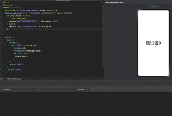
Complete sample code:
1
2
3
4
5
6
7
8
9
10
11
12
13
14
15
16
17
18
19
20
21
22
23
24
25
26
27
28
29
@Entry
@Component
struct WatchDemo {
  @State @Watch("didMessageChanged") price: number = 0;
  didMessageChanged () {  //此方法被触发,代表其它地方修改了 @Watch 修饰的变量
    if (this.price >= 10) {
      //TODO: 处理享受9折...
      console.log("监听到消息发生变化:" + this.price * 0.9)
    } else {
      console.log("监听到消息发生变化:" + this.price)
    }

  }

  build() {
    Row() {
      Column() {
        Text("测试值" + this.price)
          .fontSize(50)
          .fontWeight(FontWeight.Bold)
          .onClick( ()=> {
            this.price ++
          })
      }
      .width('100%')
    }
    .height('100%')
  }
}
Official documentation on the @Watch decorator
ForEach: Rendering in a Loop
Suppose we want to make a list like UITableView in iOS; we can use ForEach in ArkUI.
1
2
3
4
5
6
7
8
9
10
11
12
13
14
15
16
17
18
19
20
21
22
23
24
25
26
27
28
@Entry
@Component
struct ForEachDemo {
  @State message: string = 'sunyazhou.com';
  @State tags: Array<string> = ['Algorithm29','ArkTS1','AVFoundation15','AVKit1','C++19','Cocoapods5','Dart2','Git3','HarmonyOS3','iOS119','...']

  build() {
    Row() {
      Column() {
        Text(this.message)
          .fontSize(38)
          .fontWeight(FontWeight.Bold)
        Divider()
        ForEach(this.tags, (tag : string) => {
            Text("Blog tag has "+ tag)
              .textAlign(TextAlign.Start)
              .fontSize(18)
              .width('80%')
              .backgroundColor('#00E5EE')
        }, (tag: string)=>{
          return tag
        })
      }
      .width('100%')
    }
    .height('100%')
  }
}

There’s a pitfall here: in ForEach(this.tags, (tag : string*the type must be annotated here in HarmonyOS 4.1*) => {}
If you don’t annotate the type, you’ll easily get an error:
1
Use explicit types instead of "any", "unknown" (arkts-no-any-unknown) <ArkTSCheck>

ForEach: Loop Rendering (official documentation)
Common Component Properties: Click Events
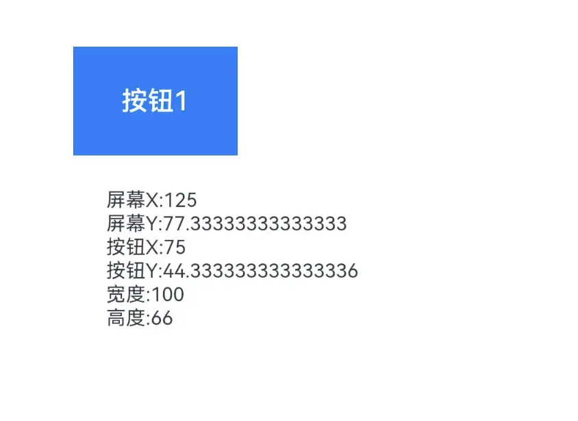
We can get the corresponding position information through the click event object.
1
2
3
4
5
6
7
8
9
10
11
12
13
14
15
16
17
18
@Entry
@Component
struct UniversalEventDemo {
  @State message: string = 'https://www.sunyazhou.com/';
  //TODO all common event properties of components
  build() {
    Column(){
      Row() {
        Button('按钮1', {type: ButtonType.Normal}).width('100').height('66')
          .onClick((event: ClickEvent) => {
            this.message =
              `屏幕X:${event.windowX} \n屏幕Y:${event.windowY} \n按钮X:${event.x} \n按钮Y:${event.y} \n宽度:${event.target.area.width} \n高度:${event.target.area.height}`
          })
      }
      Text(this.message).margin(20).fontSize(12)
    }.height('100%').alignItems(HorizontalAlign.Start).padding({top: 33, left: 50})
  }
}
The ClickEvent class can get the following variables:
Common Component Properties: Touch Events
1
2
3
4
5
6
7
8
9
10
11
12
13
14
15
16
17
18
19
20
21
22
23
24
25
26
27
28
29
30
@Entry
@Component
struct UniversalEventDemo {
  @State message: string = 'https://www.sunyazhou.com/';
  @State eventType :string = ''
  build() {
    Column(){
      Row() {
        Button('按钮1', {type: ButtonType.Normal}).width('100').height('66')
          .onTouch((event: TouchEvent)=> {
            if (event.type == TouchType.Down) {
              this.eventType = '按下-Down'
            }
            if (event.type == TouchType.Up) {
              this.eventType = '抬起-Up'
            }
            if (event.type == TouchType.Move) {
              this.eventType = '触摸中-Move'
            }
            this.message = '触摸类型:'+ this.eventType + '\n' +
              'x:' + event.touches[0].x + '\n' +
              'y:' + event.touches[0].y + '\n' +
              '宽度:' + event.target.area.width + '\n'
              '高度:' + event.target.area.height + '\n'
          })
      }
      Text(this.message).margin(20).fontSize(12)
    }.height('100%').alignItems(HorizontalAlign.Start).padding({top: 33, left: 50})
  }
}
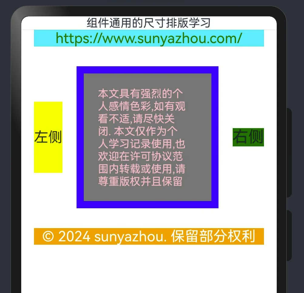
Learning Common Component Size and Layout
1
2
3
4
5
6
7
8
9
10
11
12
13
14
15
16
17
18
19
20
21
22
23
24
25
26
27
28
29
30
31
32
33
34
35
36
37
38
39
40
41
42
43
44
@Entry
@Component
struct LayoutDemo {
  build() {
    Column() {
      Text('组件通用的尺寸排版学习')
      Divider()
      Row() {
        Text('https://www.sunyazhou.com/').fontSize(20).fontColor(Color.Green).width('90%')
          .textAlign(TextAlign.Center)
      }
      .backgroundColor("#00F5FF")
      Row(){
        Text('左侧').fontSize(20).backgroundColor(Color.Yellow).height(100)
        Row() {
          Row() {
            Text('本文具有强烈的个人感情色彩,如有观看不适,请尽快关闭. ' +
              '本文仅作为个人学习记录使用,也欢迎在许可协议范围内转载或使用,' +
              '请尊重版权并且保留原文链接,谢谢您的理解合作.' +
              ' 如果您觉得本站对您能有帮助,您可以使用RSS方式订阅本站,' +
              '这样您将能在第一时间获取本站信息.')
              .fontSize(15)
              .fontColor(Color.Pink)
              .width('90%')
          }
        }
        .width(200)
        .height(200)
        .backgroundColor(Color.Gray)
        .padding(20) //外边距
        .margin({top: 28, bottom: 28, left:20, right:20}) //内边距
        .border({width: 10, color: Color.Blue}) //内部边框

        Text('右侧').fontSize(22).backgroundColor(Color.Red).backgroundColor(Color.Green)
      }
      Row() {
        Text('© 2024 sunyazhou. 保留部分权利').fontSize(20).fontColor(Color.White).width('90%')
          .textAlign(TextAlign.Center)
      }
      .backgroundColor(Color.Orange)
    }
    .backgroundColor(Color.Transparent)
  }
}
Here’s the usage of position, markAnchor, and offset.
1
2
3
4
5
6
7
8
9
10
11
12
13
14
15
16
17
18
19
20
21
22
23
24
25
26
27
28
29
30
31
32
33
34
35
36
37
38
39
40
41
42
43
44
45
46
47
48
49
@Entry
@Component
struct LayoutDemo2 {
  build() {
    Column({space:8}) { //
      Row() {
        Text('A').fontSize(24).fontColor(Color.Blue).width('25%').backgroundColor(Color.Red)
        Text('B').fontSize(24).fontColor(Color.Blue).width('25%').backgroundColor(Color.Black)
        Text('C').fontSize(24).fontColor(Color.Blue).width('25%').backgroundColor(Color.Yellow)
        Text('D').fontSize(24).fontColor(Color.Blue).width('25%').backgroundColor(Color.Grey)
      }
      .backgroundColor(Color.Green)
      .width('100%')
      .height(100)
      .direction(Direction.Rtl)

      Divider()
      Column({space: 8}) {
        Row() {
          Text('A').fontSize(24).fontColor(Color.Orange).width('25%').backgroundColor(Color.Red)
          Text('B').fontSize(24).fontColor(Color.Orange).width('25%').backgroundColor(Color.Black)
            .position({x: 66, y: 10})  //这种指定x y 适配性较差
          Text('C').fontSize(24).fontColor(Color.Orange).width('25%').backgroundColor(Color.Yellow)
          Text('D').fontSize(24).fontColor(Color.Orange).width('25%').backgroundColor(Color.Grey)
            .position({x: '70%',y: '70%'}) //推荐方式适配性比较好
        }
        .backgroundColor(Color.Green)
        .width('90%')
        .height(100)
        .direction(Direction.Ltr)
      }
      Divider()
      //当前 mark  默认: .markAnchor({x: 0, y: 0})
      Column({ space: 8}) {
        Stack() {
          Row().width(111).height(111).backgroundColor(Color.Grey)
        }
        Text("100").fontSize(22).fontColor(Color.Black).width('25').height(25).backgroundColor(Color.Red)
          .markAnchor({x: 88, y: 100}) //自己当前值 + x 80, y 100.
        Text("200").fontSize(22).fontColor(Color.Black).width('25').height(25).backgroundColor(Color.Green)
          .markAnchor({x: 88, y: 100}) //自己当前值 + x 80, y 100.
        Text("300").fontSize(22).fontColor(Color.Black).width('25').height(25).backgroundColor(Color.Blue)
          .markAnchor({x: -88, y: 160})
        Text("400").fontSize(22).fontColor(Color.Black).width('25').height(25).backgroundColor(Color.Red)
          .markAnchor({x: -88, y: 160})
      }
    }
  }
}
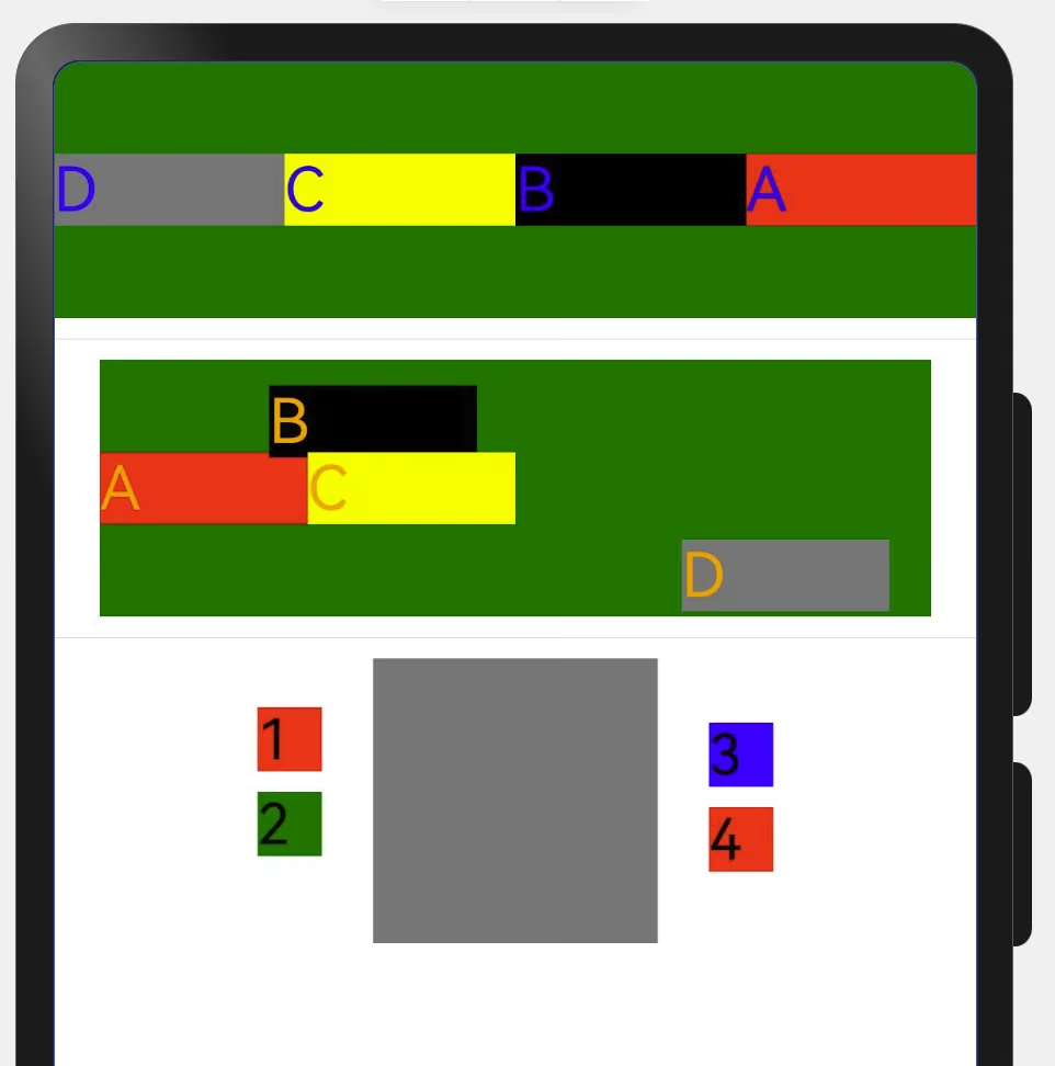
1
2
3
4
5
6
7
8
9
10
11
12
13
14
//当前 offset
Column({ space: 8}) {
  Stack() {
    Row().width(111).height(111).backgroundColor(Color.Grey)
  }
  Text("100").fontSize(22).fontColor(Color.Black).width('25').height(25).backgroundColor(Color.Red)
    .offset({x: '-22%', y: '-12%'}) //自己当前值 + x值%, y值%.
  Text("200").fontSize(22).fontColor(Color.Black).width('25').height(25).backgroundColor(Color.Green)
    .offset({x: '-22%', y: '-12%'}) //自己当前值 + x值%, y值%.
  Text("300").fontSize(22).fontColor(Color.Black).width('25').height(25).backgroundColor(Color.Blue)
    .offset({x: '22%', y: '-20%'}) //自己当前值 + x值%, y值%.
  Text("400").fontSize(22).fontColor(Color.Black).width('25').height(25).backgroundColor(Color.Red)
    .offset({x: '22%', y: '-20%'}) //自己当前值 + x值%, y值%.
}
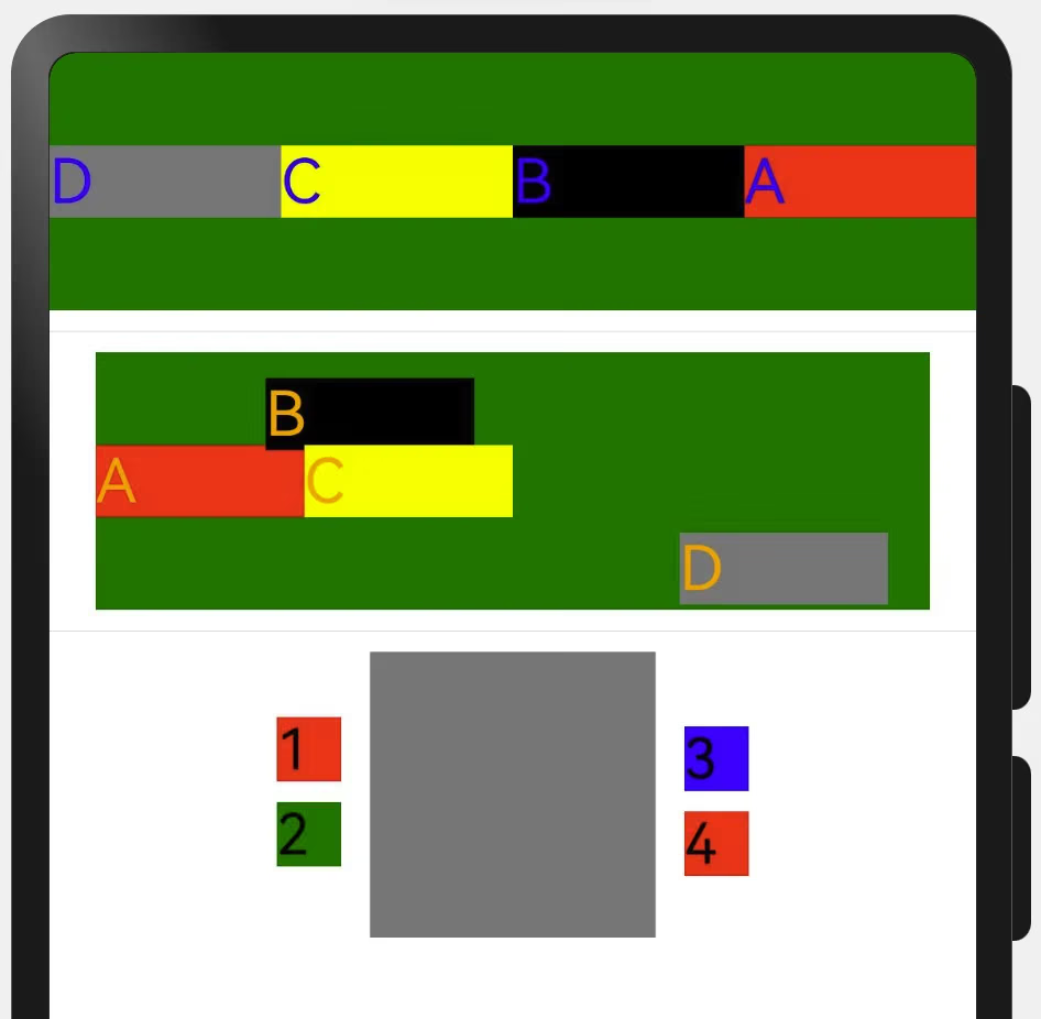
Component Alignment
The two share the same characteristic (the characteristic: width and height are obtained from outside in).
Column: main axis direction ↓, cross axis →. justifyContent is vertical. Row: main axis direction →, cross axis ↓. justifyContent is horizontal.
Flex: A Container That Can Freely Choose Horizontal or Vertical Layout
- direction: FlexDirection.Column — vertical
- direction: FlexDirection.Row — horizontal
1
2
3
4
5
6
7
8
9
10
11
12
13
14
15
16
17
18
19
20
21
22
23
24
25
26
27
28
@Entry
@Component
struct FlexPage {
  build() {
    Column({space: 20}) {
      Flex({
        direction: FlexDirection.Row, //这里Row和Column自主选择
        justifyContent: FlexAlign.SpaceEvenly, //主轴方向 .Column垂直 .Row水平
        alignItems: ItemAlign.Start, //交叉轴方向 .Cotumn 左边开始 右边开始 .Row
        //wrap: FlexWrap.Wrap //换行
        wrap: FlexWrap.NoWrap //不换行
      }) {
        Text("10").width('6%').height(60).backgroundColor(Color.Orange)
        Text("20").width('20%').height(70).backgroundColor(Color.Red)
        Text("30").width('30%').height(80).backgroundColor(Color.Blue)
        Text("40").width('16%').height(90).backgroundColor(Color.Black)
        Text("50").width('50%').height(100).backgroundColor(Color.Pink)
        Text("60").width('30%').height(90).backgroundColor(Color.Brown)
        Text("70").width('15%').height(120).backgroundColor(Color.White)
      }
      .height(180)
      .width('90%')
      .backgroundColor(Color.Gray)
    }
    .backgroundColor('#ff8ce53d')
    .width('100%')
  }
}
The following shows the Column alignment directions.
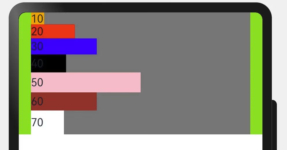
The following shows the Row alignment directions.
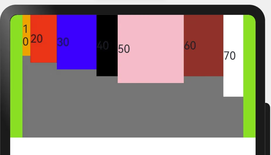
Summary
Keep accumulating notes anytime.